Transition animation for background change
For smooth animation on a webpage, we should use the opacity CSS property to animate changes in background-color. But how? Use the pseudo element with a new background-color value and toggle its opacity value between 0 and 1!
TL;DR
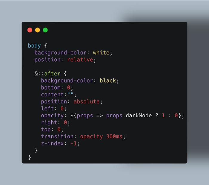
body {
  /* Set the default background color */
  background-color: white;     /* Enable the positioning of the pseudo element */
  position: relative;&::after {
    /* Set the new background color */
    background-color: black;     /* Render the pseudo element */
    content: "";                 /* Cover the entire page with the pseudo element */
    position: absolute;
    top: 0;
    bottom: 0;
    left: 0;
    right: 0;    /* Render the new background color beneath the page content */
    z-index: -1;    /* Toggle opacity between 0 and 1 (with styled-components) */
    opacity: ${props => props.darkMode ? 1 : 0};    /* Animate opacity changes */
    transition: opacity 300ms;
  }
}
For a web app that I was building, I wanted to apply some transition animation for changing the entire page’s background color. I learned something new to implement this feature. So let me share it with you.
Don’t animate the background-color property
A naive solution is to apply CSS transitions to the background-color property, with something like
transition: background-color 250ms;For performance reasons, however, I knew CSS transitions (as well as CSS animations) are only recommended for three CSS properties: transform, opacity, and filter.
It takes quite a bit of technical details to understand why. Perhaps the best explanation is offered by Lewis and Irish (2013) who explain it by starting with how browsers implement CSS declarations. For a deeper explanation, see Tabalin (2015). For the pitfalls of animating transform and opacity, and how to deal with them, see Chikuyonok (2016).
Use opacity to change the background color
The opacity property seems to be relevant to the background color. But I couldn’t imagine how it could be used for changing the background color.
Google search doesn’t immediately help me. Quite a few people ask how to animate the change of background-color, and the naive answers abound, ignoring the performance concern.
As far as I can find, there’s only one page, a tutorial from OpenClassrooms (Gerke and Wardeh 2020), which takes the performance issue seriously. To read this tutorial, you need to sign up OpenClassrooms, but it’s totally free of charge.
The tutorial explains the technique for changing the button background upon hover. The idea is to overlay the button’s background with a pseudo-element whose background color is different from the button. This overlaid pseudo-element is transparent (i.e. opacity: 0) by default. When the user hovers over the button, change the opacity to 1 with a CSS transition declared with transition: opacity 250ms.
I managed to apply this technique to change the background for the entire page, that is, the background-color property of the body element. Let me share with you how I did it.
Step 1: Overlay the body with an ::after pseudo element
First, create an ::after pseudo element for the body element:
body::after {
  content: ""
}
If you use SASS or its offsprings (such as Styled-Components):
body {
  &::after {
    content: ""
  }
}
Below I’ll keep using this SASS syntax (because I use Styled-Components).
The pseudo element requires the content property to be specified. Otherwise it won’t show up. This fact is rarely mentioned except Ball (2018).
Then make this pseudo element spread across the entire extent of the body element:
body {
  position: relative;  &::after {
    bottom: 0;
    content:””;
    position: absolute;
    left: 0;
    right: 0;
    top: 0;
  }
}
Setting the position property to be relative for a parent element and absolute for a child element is a very convenient layout technique. See James (2017) for detail.
Then, set bottom, left, right, and top to be all zero so that the pseudo element will spread over the entire extent of the body element. This technique is a bit tricky to understand. I recommend reading Friedland (2019).
Finally, position the pseudo element beneath the other children of the body element (i.e. all the page contents) by applying z-index: -1.
body {
  position: relative;&::after {
    bottom: 0;
    content:””;
    position: absolute;
    left: 0;
    right: 0;
    top: 0;
    z-index: -1;
  }
}
Without the z-index: -1, the pseudo element will hide everything on the page. Understanding how z-index works is also tricky. Walton (2013) offers the best account that I’ve seen so far.
The CSS code up to now is an application of the multiple background technique described in Gallagher (2010).
Step 2: Set the background color
Now specify the background color. Suppose the default background color of the page is white. And you want to change it to black when the user does something (say, pushing the button for Dark Mode). For this purpose, add background-color properties as follows:
body {
  background-color: white;
  position: relative;&::after {
    background-color: black;
    bottom: 0;
    content:””;
    position: absolute;
    left: 0;
    right: 0;
    top: 0;
    z-index: -1;
  }
}
The pseudo element assumes the role of a new background after the user’s action.
Step 3: Use opacity to set the default background color
The pseudo element is always on top of its parent element, that is, the body element in our case (even if its z-index is negative). See ZYinMD (2019).
To show the body's background color, therefore, we need to make the pseudo element transparent by using the opacity property:
body {
  background-color: white;
  position: relative;&::after {
    background-color: black;
    bottom: 0;
    content:””;
    position: absolute;
    left: 0;
    opacity: 0;
    right: 0;
    top: 0;
    z-index: -1;
  }
}
This way, by default, we will see the white background specified in the body element.
Step 4: Toggle opacity to change the background color
Now it’s time to use JavaScript to toggle the opacity value between 0 and 1 in response to the user’s action.
Here I’ll explain how to toggle the opacity value with the CSS-in-JS approach with Styled-Components. Skip to Step 5 if you are not interested.
To refactor the above SASS code for Styled-Components, create GlobalStyle.js with the following JavaScript code:
// GlobalStyle.jsimport { createGlobalStyle } from 'styled-components';const GlobalStyle = createGlobalStyle`body {
  background-color: white;
  position: relative;&::after {
    background-color: black;
    bottom: 0;
    content:””;
    position: absolute;
    left: 0;
    opacity: 0;
    right: 0;
    top: 0;
    z-index: -1;
  }
}export default GlobalStyle;
We need to use createGlobalStyle to style the body element and its pseudo elements (see Styled-Components 2019 for detail).
To toggle the opacity value, use props (documentation):
// GlobalStyle.jsimport { createGlobalStyle } from 'styled-components';const GlobalStyle = createGlobalStyle`body {
  background-color: white;
  position: relative;&::after {
    background-color: black;
    bottom: 0;
    content:””;
    position: absolute;
    left: 0;
    opacity: ${props => props.darkMode ? 1 : 0};
    right: 0;
    top: 0;
    z-index: -1;
  }
}export default GlobalStyle;
This means that if the darkMode prop value is true, opacity: 1. Otherwise, opacity: 0. The prop name can be anything. As we change the background color from white to black in our case, darkMode is perhaps the most appropriate.
Then render the GlobalStyle component with the darkMode prop value to be a state variable updated by the user’s action (call it, say, darkMode). If you use create-react-app to build a React app, edit App.js as follows:
import React from 'react';
import Home from './Home';import GlobalStyle from './GlobalStyle';class App extends React.Component {
  render() {
    return (
      <>
        <GlobalStyle darkMode={darkMode} />
        <Home />
      </>
    );
  }
}export default App;
where we assume that the top level component is called Home.
We’re now ready to add transition animation (phew!).
Step 5: Apply a CSS Transition to opacity change.
Include the transition property as follows:
body {
  background-color: white;
  position: relative;&::after {
    background-color: black;
    bottom: 0;
    content:””;
    position: absolute;
    left: 0;
    opacity: ${props => props.darkMode ? 1 : 0};
    right: 0;
    top: 0;
    transition: opacity 300ms;
    z-index: -1;
  }
}
NOTE: The opacity property value uses the Styled-Component’s syntax, explained in Step 4 above. Replace it with what’s appropriate if you use another way of applying CSS styles.
The duration is set to be 300ms. It is the recommended value for animation on the entire screen (Naimark 2018).
We’re now all set!
This article is part of Web Dev Survey from Kyoto, a series of my blog posts on web development. It intends to simulate that the reader is invited to Kyoto, Japan, to attend a web dev conference. So the article ends with a photo of Kyoto in the current season, as if you were sightseeing after the conference was over.
So let me take you to Arashiyama, an western area of Kyoto famous for beautiful nature along the river:

References
Ball, Kevin (2018) “Cool uses of the ::before and ::after pseudoelements”, DEV, Mar. 29, 2019.
Chikuyonok, Sergey (2016) “CSS GPU Animation: Doing It Right”, Smashing Magazine, Dec. 9, 2016.
Friedland, Matsuko (2019) “CSS Almanac: top / bottom / left / right”, CSS-Tricks, Nov. 3, 2019.
Gallagher, Nicolas (2010) “Multiple Backgrounds and Borders with CSS 2.1”, nicolasgallagher.com, Jun. 10, 2010.
Gerke, Pat, and Mahmoud Wardeh (2020) “Create Modern CSS Animations”, OpenClassrooms, Apr. 2, 2020.
James, Oliver (2017) “Advanced Positioning”, Interneting Is Hard, 2017.
Lewis, Paul, and Paul Irish (2013) “High Performance Animations”, HTML5 Rocks, Nov. 7, 2013.
Naimark, Jonas (2018) “Motion Design Doesn’t Have to be Hard”, Google Design, Sep. 27, 2018.
Styled-Components (2019) “API Reference: Helpers”, Styled-Components Documentation, 2019.
Tabalin, Artem(2015) “An Introduction to Hardware Acceleration with CSS Animations”, SitePoint, Dec. 1, 2015.
Walton, Philip (2013) “What No One Told You About Z-index”, philipwalton.com, Jan. 15, 2013
ZYinMD (2019) “Why can’t an element with a z-index value cover its child?”, StackOverflow, Feb. 27, 2019


